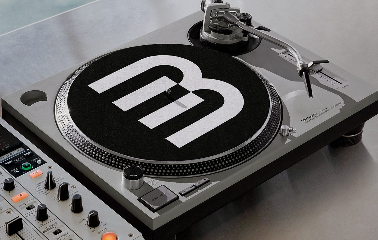
If you’ve been following along, BPM Music recently set out to update its online platforms, homepages and websites, and branding overall. As a growing suite of services for musicians of all kinds, BPM Music has a product offering and a mission statement that continues to evolve with the landscape of the music industry.
Tasked with building a completely new brand identity and logo was New York-based design and branding studio Porto Rocha. This well-respected agency is known for developing creative and strategic work that engages with the world we live in. Porto Rocha has launched brands, products, books, websites, campaigns, and experiences with clients that range from global tech and retail companies to independent artists and cultural institutions. Some of their top clients include Apple, Google, Nike, Spotify, Netflix, YouTube, Twitch, Universal Music, and so many more.
Porto Rocha completed a deep dive of research and development to gather as many resources as possible to fully understand BPM Music’s audience. The agency stated that BPM Music needed an “identity that would allow them to show up as a leader in both music tech and music culture. The new identity system and website do just that — giving BPM a sharper visual expression and a more confident point of view in their space.”
Read more about BPM Music’s branding update in the excerpt below from Porto Rocha’s website and check out a visual case study here.
“For DJs, it all starts with the tracks: discovering new songs, unearthing deep cuts, mixing and recontextualizing, and ultimately sharing what you make with others.
Enter BPM Music, the leading suite of digital music services offering access to a vast library of songs and sounds from nearly every genre: electronic, hip-hop, R&B, Latin, and more. Operating at the intersection of music and tech, BPM functions as a record pool of recordings from 100+ prominent labels — ready to be used by DJs, producers, musicians, and other industry pros.
Already known for their library, what BPM lacked was an identity that would allow them to show up as a leader in both music tech and music culture. The new identity system and website do just that — giving BPM a sharper visual expression and a more confident point of view in their space.
Riffing on the visual cues of track mixing, the system transforms simple elements into ownable gestures that connect back to BPM’s product without being too literal. In layouts, vertical dividing lines reminiscent of beat intervals create visual rhythm; in a new logo, the symbol references keys of a keyboard, drum pad or a laptop, playing on the brand’s musical and technical sides.
Inspired by nightlife event posters, BPM’s bold, condensed headline typeface allows the brand to feature artist names more prominently in communications. We expanded a previously-limited color approach to match the energy of the music community, combining electric hues that recall buttons on DJ controllers with trustworthy neutrals. The palette brings clarity to BPM’s brand architecture, too; products and sub-brands each get their own color within an intuitive system.
Creating a truly intuitive experience was also at the core of the website redesign. Featuring editorial modules, engaging interactions, and a dark mode reflective of a nightlife setting familiar to their DJ audience, the new site makes the music discovery process even more effortless and enjoyable.
With all elements of the identity in sync, BPM Music’s visual language finally reflects both the precision of their product and the culture of their community.”
Visit Porto Rocha’s website to learn more about the studio or follow their work on Instagram.

